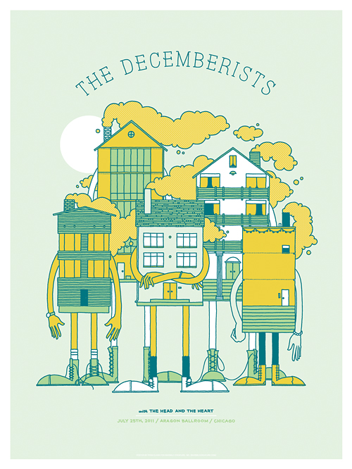
 Here's a look at the poster we recently created for the Chicago date of The Decemberists' current tour. Looks like Chicago has some rough neighborhoods. Available in the store now!
Filtering by Category: Illustration,Metal
 What is Heartwork?
Heartwork is a project designed to raise money for art supplies within the art room at Target House—this wonderful home-away-from-home for the families of children facing long-term treatment at St. Jude Children’s Research Hospital.
The whole idea started simply enough. We, along with a few other creative individuals, were asked to work on various design projects for Target House. But, in the process, we were so deeply moved by the experience that we didn’t want it to end. We witnessed first hand the special connection the kids had with the art room in particular. It was a place where we saw kids at all stages of health just being kids.
So, we began to wonder, “What if we could create a ongoing way to support more and better art supplies for these children?” It was then that Heartwork was born.
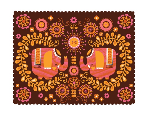
The idea is simple. Every year, a group of talented artists will create a series of prints to raise money for the art room. Each of the prints will feature a different interpretation of the Target House elephant mascot, chosen because it represents family, long life, strength and playfulness—attributes with special meaning at a place designed for families to live, play and heal.
Print details:
Archival giclee - printed with pigment inks on archival cotton rag paper Size: 11 inches x 14 inches Signed & numbered editions of 40
Purchase the prints here.
"Elephants Love Ooey Gooey Peanut Butter" by Johnny Yanok:
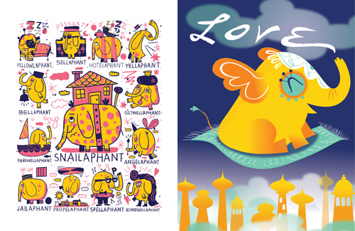
"Snailaphant" by Nate Williams and "When Elephants Fly" by Anna Chambers:
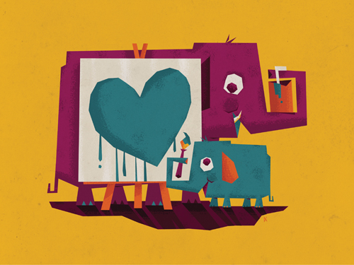
"Collaboration" by Don Clark
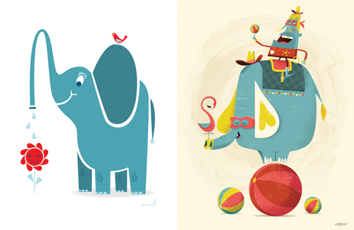
"Love To Grow" by Scott Thares and "Balancing Act" by Christopher Lee:
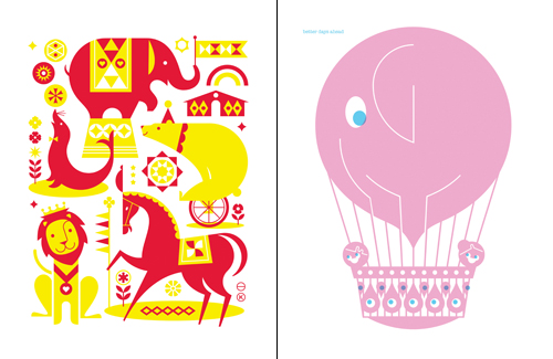
"Circus" by Katie Kirk and "Better Days Ahead" by Richard Boynton:
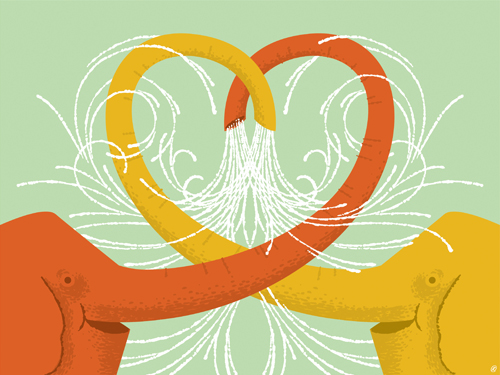
"Waterworks" by Ryan Clark:
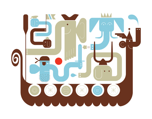
"Tuskers Ahoy" by Michael Bartalos:
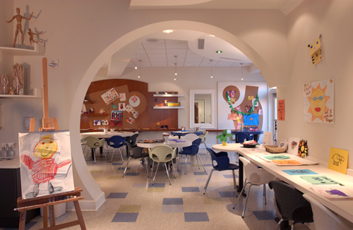
The Scott Hamilton Arts & Crafts Room at Target House:
We're honored to be part of this project and thankful for everyone who donated their time and talent.


It's officially summer. At least that's what we've been told anyways. Join in the fun by grabbing our new Splash 'N Squirt and Happy Birthday Gift Cards. Many thanks to our awesome A.D.'s: Brian Holt, Ted Halbur & Aaron Muther!
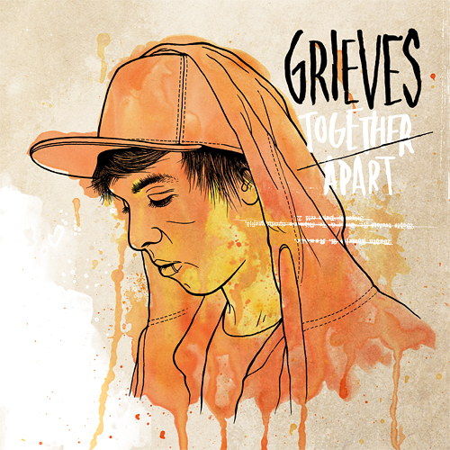 We recently had the luxury of working with Rhymesayers Entertainment once again, this time for Seattle-based artist Grieves. RS is one of the only labels still investing their time, effort and finances into elaborate physical packaging... because they care and they believe their listeners deserve it. And obviously we love any opportunity to work with cool, innovative people to create unique packaging and artwork. Check out this video of the new Grieves package for "Together/Apart," and be sure to pick up the record June 21st.
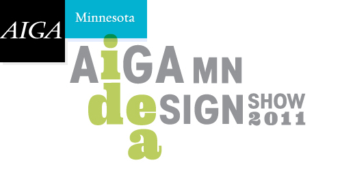 We're honored that we could help out with Target's 7 cube win the other night at AIGA Minnesota's annual Design Show. Go Bullseye.
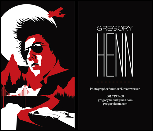
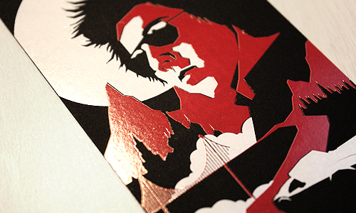
Just wrapped up this business card design for our buddy, Gregory Henn. The inspiration was old movie posters with a modern twist. Killer 2-color foil stamping courtesy of Evolution Press.
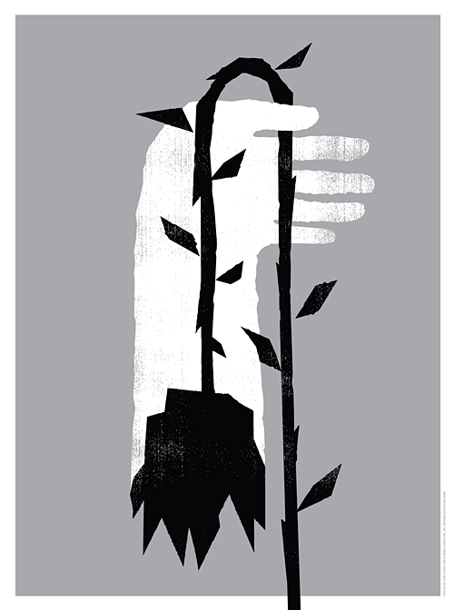


When asked if we'd be interested in creating a poster for the new EMP exhibit 'Nirvana: Taking Punk To The Masses', we had to think about it for about zero seconds. After listening to each record a few times, I decided to base my concept on the song 'Scentless Apprentice', my favorite track from In Utero. Many thanks to Chris, Jacob and the EMP for asking us. Pick one up here (we only have 15 of these suckers) and be sure to check out the exhibit if you find yourself in these parts.
2-color (metallic silver and black) silk-screened poster on white stock.
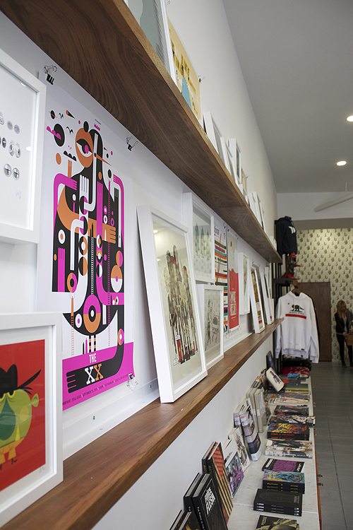
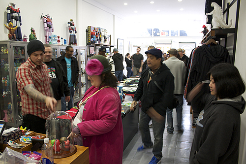
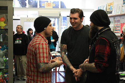
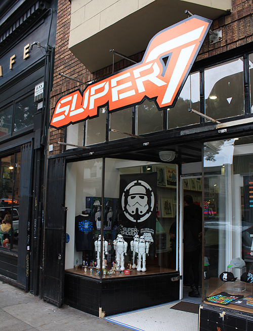
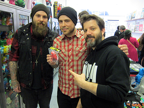
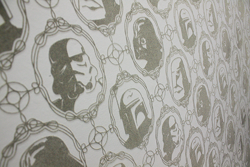
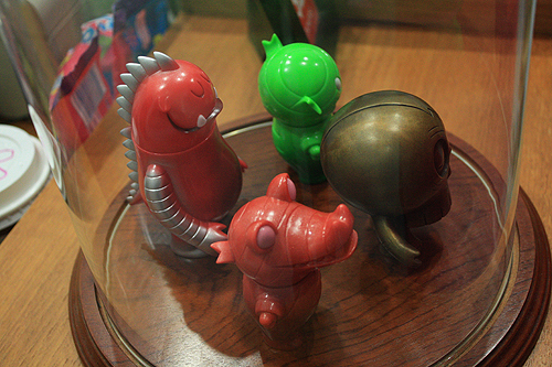
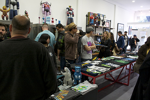
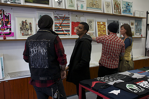
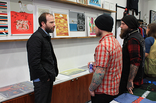
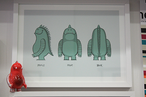
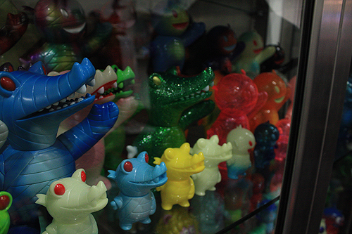
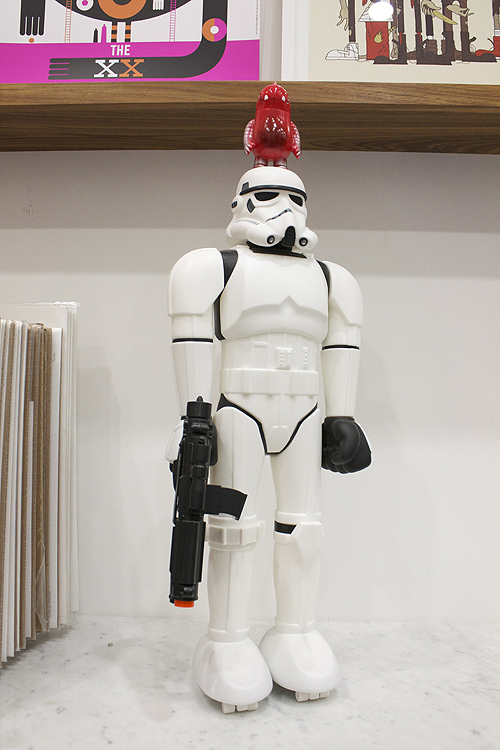
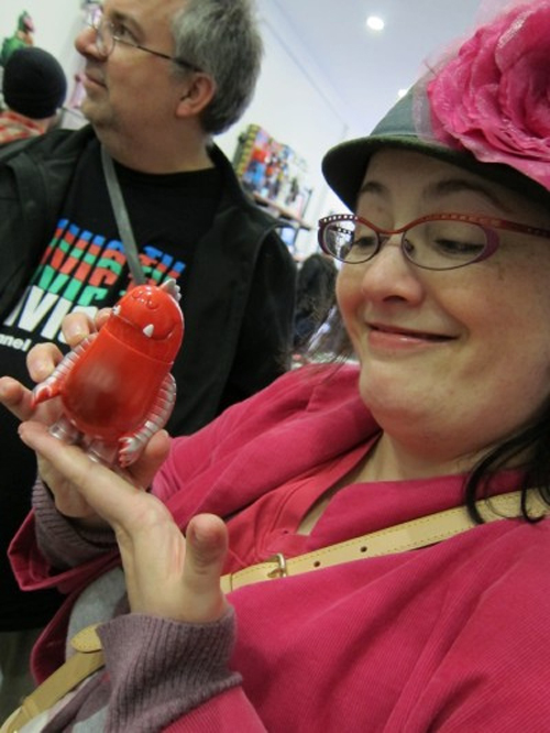
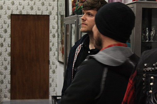
A mighty big thanks to everyone who came out to our Full Circle show/Leroy C. launch party at Super7 on Saturday night. We had a blast. And as you can see above, Leroy did too.
If you find yourself in SF anytime soon, the show will be up for a few more weeks.
Photos courtesy of Zac Schwiet, Kaiju Chronicle and Toybot Studios.
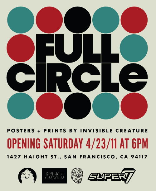 We're excited to announce that we'll be showing a collection of work at the Super7 store in San Francisco, opening on April 23rd at 6PM. We'll also be debuting the first colorway of Leroy C., the newest member of the IC family! Super7 will have a limited amount on hand to take home.
We'll be sharing a collection of 20+ posters and prints, including a number of illustrations from our late grandfather, Alfred Paulsen. As someone who influenced our work tremendously and spent much of his young adult life in the bay area, we thought it would be fitting to include some of his work in the show.

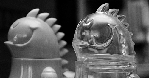
We'll also have a few new limited Leroy C. prints available. Come out and say hi!

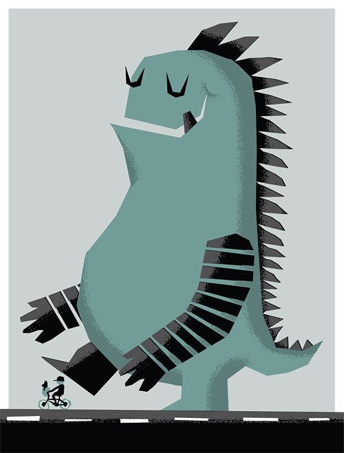
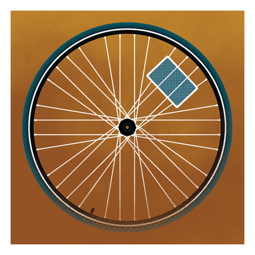
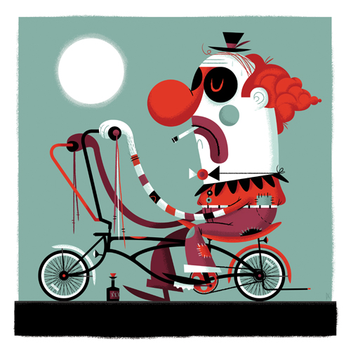
We recently wrapped two 12" x 12" pieces for Poster Cabaret's annual bicycle art project. 'Spokes' and 'Whino' will be available to purchase next month. Live in or around Austin? Be sure to check out the gallery event celebrating the project: The Poster Cabaret Bicycle Print Show on May 5th at The Gallery Black Lagoon.
Details: A month-long exhibit in May (national bike month) featuring over 60 art prints inspired by the bicycle. Opening: Thursday, May 5, 2011 (6pm-9pm)
Be there!
 Another spot circa 1970's. Client: Unknown.
We often get asked what our process is like. While we have multiple ways of conceptualizing and pitching ideas, the 3-step process that I'm going to outline below is pretty standard fare for us, as I'm sure it is with many illustrators. Sketch, sketch some more, sketch again, then on to final. 'Final' for us, usually means we hop into Illustrator and block out shapes. Once we have our shapes dialed and approved, we move on to lining and shading in Photoshop. There are many times when we start and finish in Photoshop as well, but a typical project like this will begin as vector art. I thought it might be fun to break down the evolution of an illustrated project, specifically a Gift Card for Target. Let us begin ...
With the majority of art direction already fleshed out by the wonderful team at Target, we're given the project and asked to create sketches based on their initial ideas. Since their initial ideas are always completely awesome, it's a joy to build off of them. The name of this particular card is 'Glow-In-The Dark Space Maze'. In this case, it's a card that doubles as a glow-in-the-dark space maze that doubles as a spaceship. Wait, is that triples as? ... Nevermind.
The first task is the game itself. The manufacturer needs to get started on producing these suckers, so the game dieline is first priority. After a few sketches, we dial it down and come up with our shape.

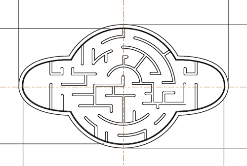
After the basic game shape is a wrap, we get to the fun part - figuring out the maze! After heading to the store to pick up a few similar maze games, we play, throw down to the floor and curse at said maze games. Once we think we know what we're doing, we start to sketch out our walls. To make it easier, we're given the ball diameter and wall thickness before we begin. After a zillion attempts, the sketch below is the winning configuration - which means anyone under the age of 5 can conquer the game in under 1 minute while the rest of us need about an hour.
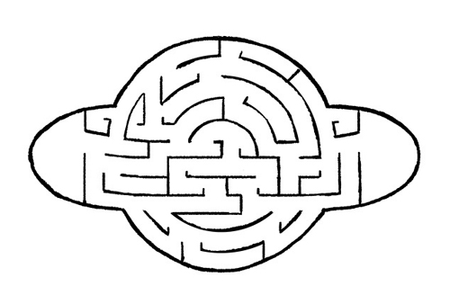
After the sketch is approved (and tweaked a little), we move to final vector art for the manufacturer. Bada-bing:
After the game material is off being made, it's time to move into final art. With the nature of this card being glow-in-the-dark, the client asks that we use bright colors. Done. Here are a few colors we pitched:
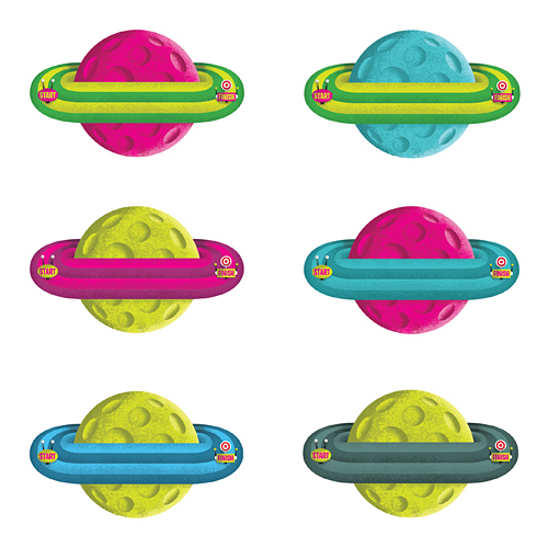
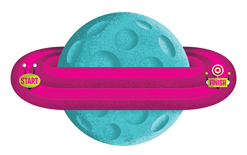
... as well as this color scheme, which ultimately gets chosen.
So now that the game itself is done, time to start sketching the actual card backer - which is always a big chunk of the fun. We sent the client a few options, with this particular idea taking home the trophy ...
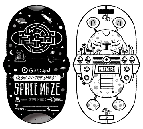
So now what's next? You guessed it. A few tweaks, then on to Illustrator. That's when we start blocking out shapes and finalizing color schemes. After a few rounds of small revisions, we have our final ready for shading ...
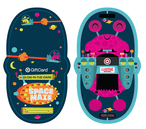
And there you have it ... a finished Gift Card. That was fun, right? Now it's your turn.
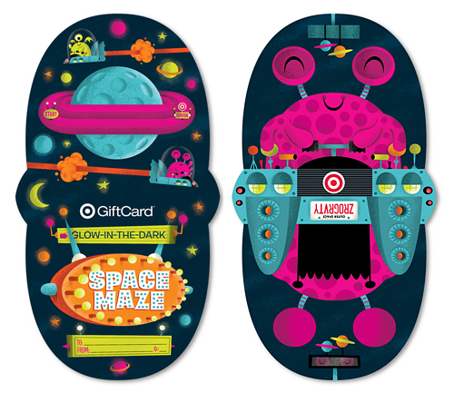
See it a bit larger in our portfolio. Now go grab one and keep the cursing to a minimum please.
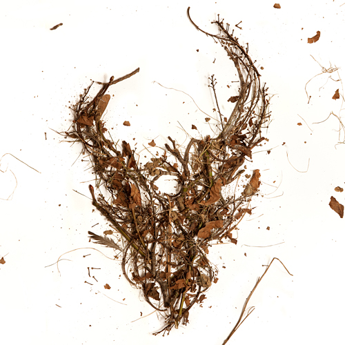 Here is the cover for an upcoming Demon Hunter release featuring the first 3 albums in one package. The 3 disc set will be available everywhere March 8th. If you've had trouble finding these older releases in a store near you, here's the chance to get them all (and cheaply). As always, the DH demon skull graces the cover, this time made from the trees of my back yard. I gathered up some fallen branches and leaves, constructed the logo on a large sheet of white paper, and Jerad Knudson shot the photo.
 Hayley Rader sent us this amazing charcoal drawing of Ryan. I thought it was great and had to share. Don't tell my brother.
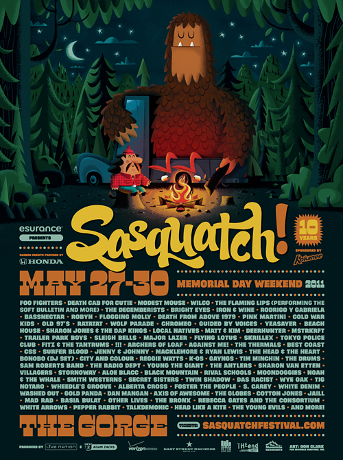 It's that time of year again. The lineup has been announced for the 2011 Sasquatch! Music Festival. And to celebrate, Salvatore and George are roastin' up s'mores. With this year being the 10th anniversary of the festival, we have some extra special plans. Stay tuned.
Oh, and how great is the lineup this year?
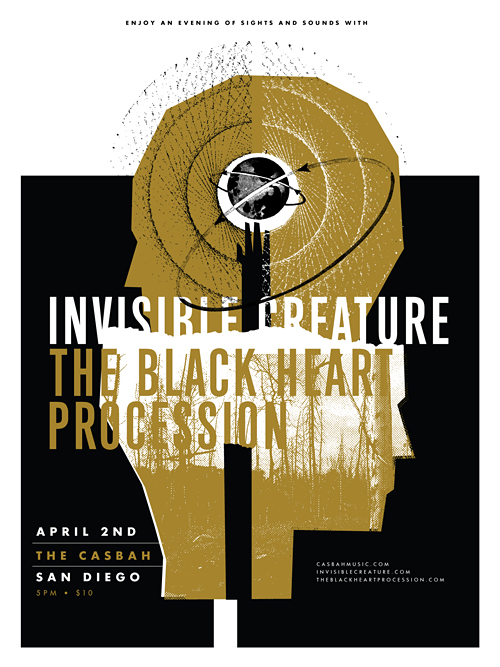 Last year, our buddy Josh Higgins asked if we'd cruise down to his city sometime to tell our story and flash some .jpg's on a big screen. We happily agreed, so here we are. We're excited to bring our dog and pony show to the beautiful city of San Diego on April 2nd. We'll be speaking at the legendary Casbah club, but what we're most excited about is The Black Heart Procession will be joining us to shut down the evening. Oh, and a little bonus for you early birds: The first 200 folks through the door get an 18" x 24" silk-screened poster, namely the one you see above. Tickets are $10 advance/$12 day of show and you can purchase them here.
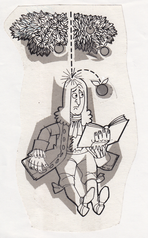 Another spot from Grandpa. This time it's Newton. Date: unknown. Publication: unknown.


We recently completed posters for 2 events serendipitously taking place on the same night (January 22nd), albeit across the nation from one another. Aziz Ansari will be knocking the socks off of a presumably packed house at Carnegie Hall, while I'll be here in Seattle, in awe of White Lies and all of their glory. The Aziz poster is 5 colors, and White Lies is 2 colors, both of which feature metallic silver ink. In the store now!
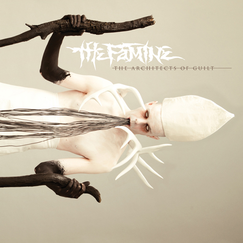 We just wrapped up the artwork for our friends, The Famine, and after an interesting photo shoot of blowing black body paint on a total stranger through a straw, I'm glad to say I'm pleased with the outcome. Be afraid.
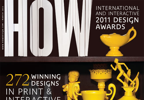 We're honored to have a few projects for