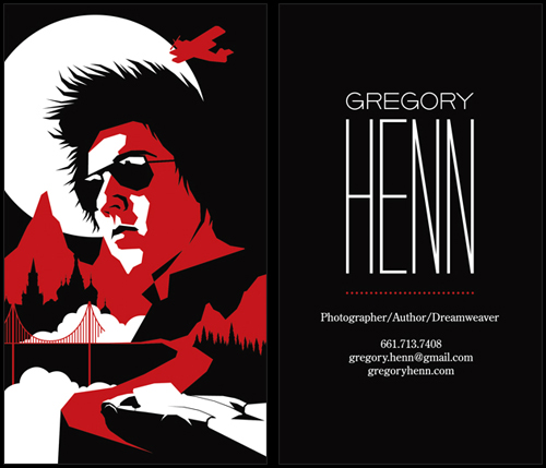
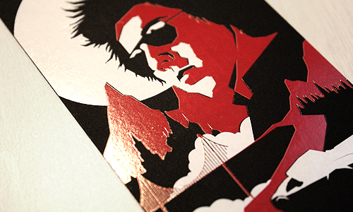
Just wrapped up this business card design for our buddy, Gregory Henn. The inspiration was old movie posters with a modern twist. Killer 2-color foil stamping courtesy of Evolution Press.
Filtering by Category: Illustration,Bum Out


Just wrapped up this business card design for our buddy, Gregory Henn. The inspiration was old movie posters with a modern twist. Killer 2-color foil stamping courtesy of Evolution Press.
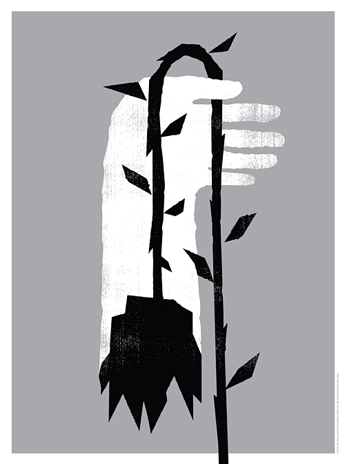


When asked if we'd be interested in creating a poster for the new EMP exhibit 'Nirvana: Taking Punk To The Masses', we had to think about it for about zero seconds. After listening to each record a few times, I decided to base my concept on the song 'Scentless Apprentice', my favorite track from In Utero. Many thanks to Chris, Jacob and the EMP for asking us. Pick one up here (we only have 15 of these suckers) and be sure to check out the exhibit if you find yourself in these parts.
2-color (metallic silver and black) silk-screened poster on white stock.
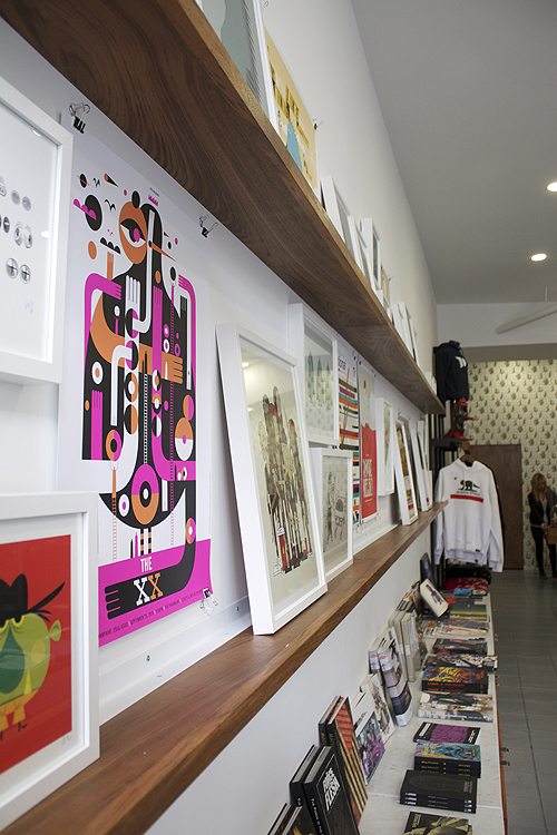
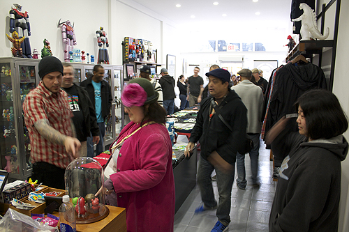
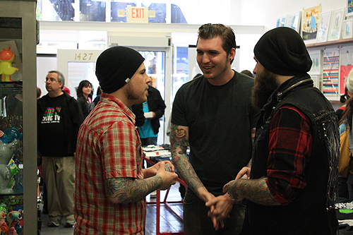
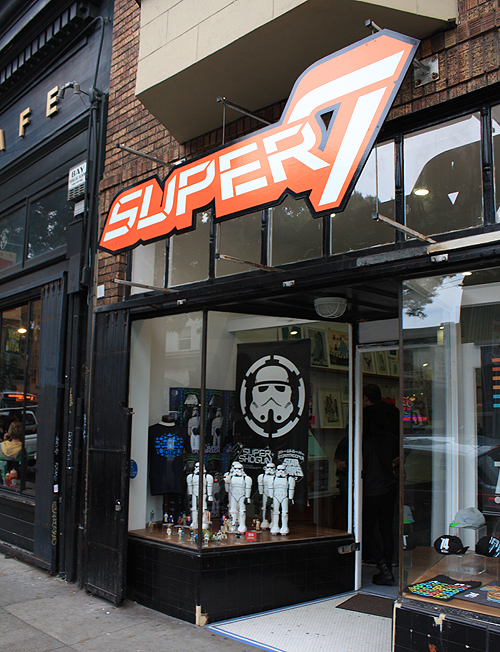
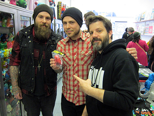
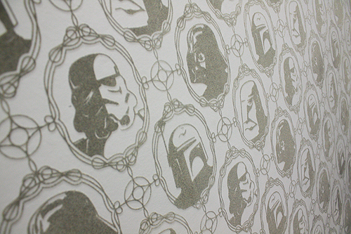
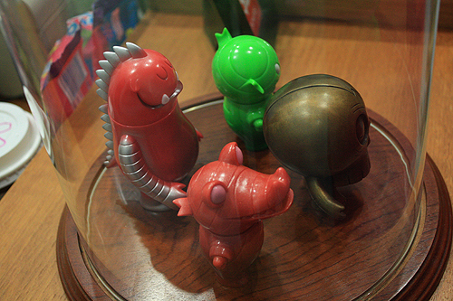
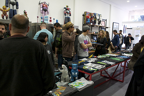
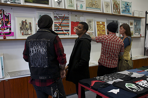
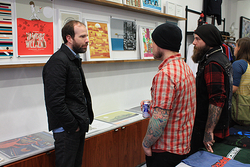
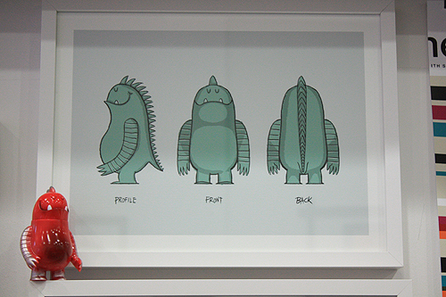
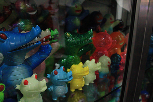
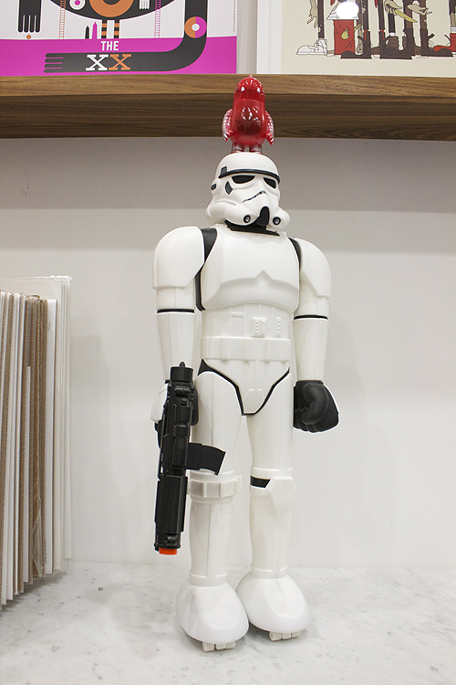
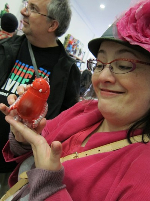
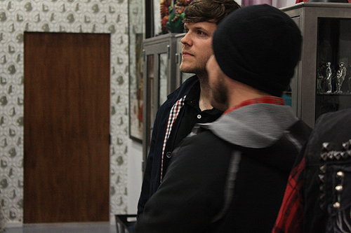
A mighty big thanks to everyone who came out to our Full Circle show/Leroy C. launch party at Super7 on Saturday night. We had a blast. And as you can see above, Leroy did too.
If you find yourself in SF anytime soon, the show will be up for a few more weeks.
Photos courtesy of Zac Schwiet, Kaiju Chronicle and Toybot Studios.
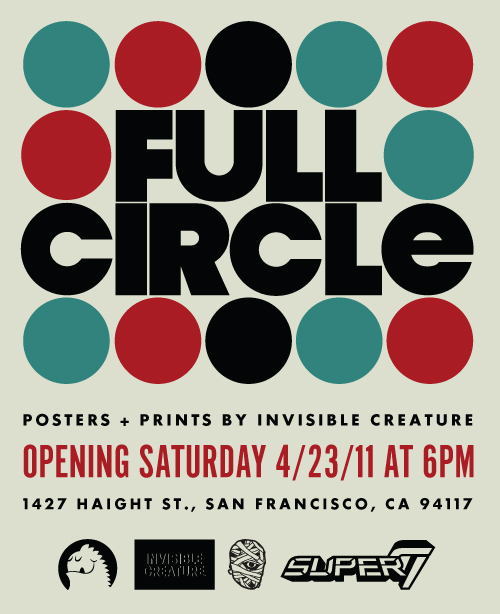 We're excited to announce that we'll be showing a collection of work at the Super7 store in San Francisco, opening on April 23rd at 6PM. We'll also be debuting the first colorway of Leroy C., the newest member of the IC family! Super7 will have a limited amount on hand to take home.
We'll be sharing a collection of 20+ posters and prints, including a number of illustrations from our late grandfather, Alfred Paulsen. As someone who influenced our work tremendously and spent much of his young adult life in the bay area, we thought it would be fitting to include some of his work in the show.

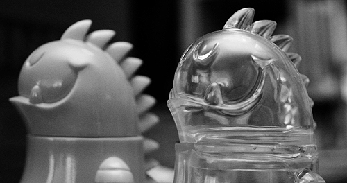
We'll also have a few new limited Leroy C. prints available. Come out and say hi!

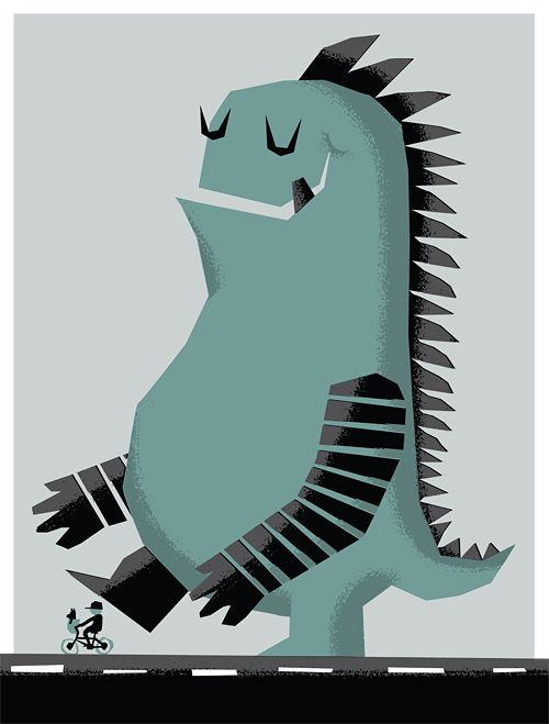
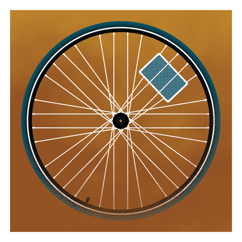
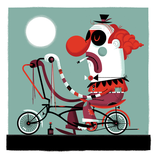
We recently wrapped two 12" x 12" pieces for Poster Cabaret's annual bicycle art project. 'Spokes' and 'Whino' will be available to purchase next month. Live in or around Austin? Be sure to check out the gallery event celebrating the project: The Poster Cabaret Bicycle Print Show on May 5th at The Gallery Black Lagoon.
Details: A month-long exhibit in May (national bike month) featuring over 60 art prints inspired by the bicycle. Opening: Thursday, May 5, 2011 (6pm-9pm)
Be there!
 Another spot circa 1970's. Client: Unknown.
We often get asked what our process is like. While we have multiple ways of conceptualizing and pitching ideas, the 3-step process that I'm going to outline below is pretty standard fare for us, as I'm sure it is with many illustrators. Sketch, sketch some more, sketch again, then on to final. 'Final' for us, usually means we hop into Illustrator and block out shapes. Once we have our shapes dialed and approved, we move on to lining and shading in Photoshop. There are many times when we start and finish in Photoshop as well, but a typical project like this will begin as vector art. I thought it might be fun to break down the evolution of an illustrated project, specifically a Gift Card for Target. Let us begin ...
With the majority of art direction already fleshed out by the wonderful team at Target, we're given the project and asked to create sketches based on their initial ideas. Since their initial ideas are always completely awesome, it's a joy to build off of them. The name of this particular card is 'Glow-In-The Dark Space Maze'. In this case, it's a card that doubles as a glow-in-the-dark space maze that doubles as a spaceship. Wait, is that triples as? ... Nevermind.
The first task is the game itself. The manufacturer needs to get started on producing these suckers, so the game dieline is first priority. After a few sketches, we dial it down and come up with our shape.

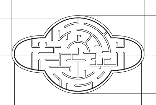
After the basic game shape is a wrap, we get to the fun part - figuring out the maze! After heading to the store to pick up a few similar maze games, we play, throw down to the floor and curse at said maze games. Once we think we know what we're doing, we start to sketch out our walls. To make it easier, we're given the ball diameter and wall thickness before we begin. After a zillion attempts, the sketch below is the winning configuration - which means anyone under the age of 5 can conquer the game in under 1 minute while the rest of us need about an hour.
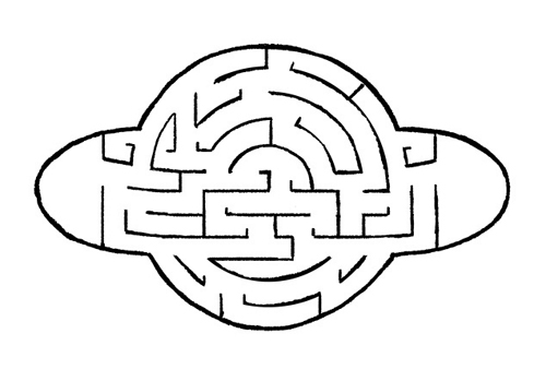
After the sketch is approved (and tweaked a little), we move to final vector art for the manufacturer. Bada-bing:
After the game material is off being made, it's time to move into final art. With the nature of this card being glow-in-the-dark, the client asks that we use bright colors. Done. Here are a few colors we pitched:
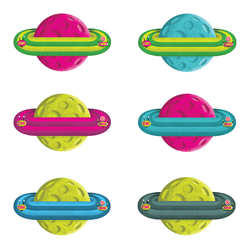
... as well as this color scheme, which ultimately gets chosen.
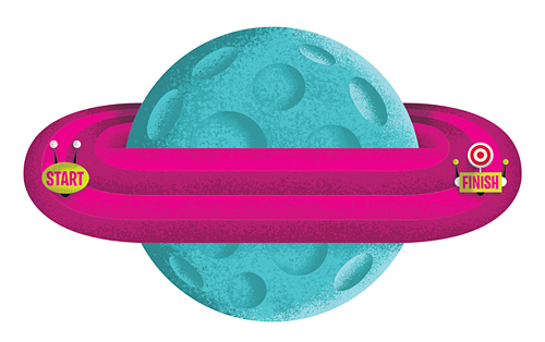
So now that the game itself is done, time to start sketching the actual card backer - which is always a big chunk of the fun. We sent the client a few options, with this particular idea taking home the trophy ...
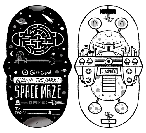
So now what's next? You guessed it. A few tweaks, then on to Illustrator. That's when we start blocking out shapes and finalizing color schemes. After a few rounds of small revisions, we have our final ready for shading ...
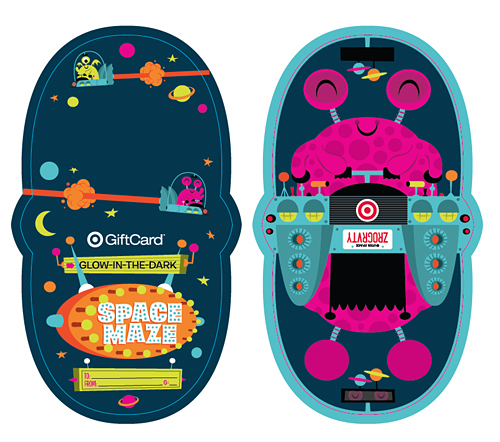
And there you have it ... a finished Gift Card. That was fun, right? Now it's your turn.
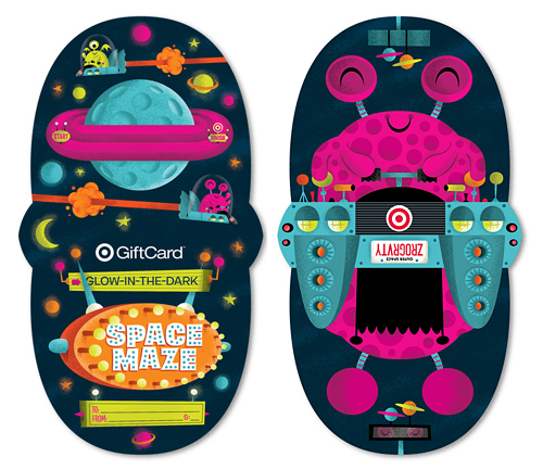
See it a bit larger in our portfolio. Now go grab one and keep the cursing to a minimum please.
 Hayley Rader sent us this amazing charcoal drawing of Ryan. I thought it was great and had to share. Don't tell my brother.
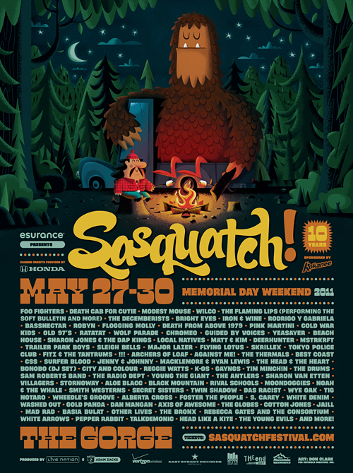 It's that time of year again. The lineup has been announced for the 2011 Sasquatch! Music Festival. And to celebrate, Salvatore and George are roastin' up s'mores. With this year being the 10th anniversary of the festival, we have some extra special plans. Stay tuned.
Oh, and how great is the lineup this year?
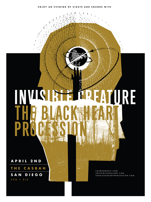 Last year, our buddy Josh Higgins asked if we'd cruise down to his city sometime to tell our story and flash some .jpg's on a big screen. We happily agreed, so here we are. We're excited to bring our dog and pony show to the beautiful city of San Diego on April 2nd. We'll be speaking at the legendary Casbah club, but what we're most excited about is The Black Heart Procession will be joining us to shut down the evening. Oh, and a little bonus for you early birds: The first 200 folks through the door get an 18" x 24" silk-screened poster, namely the one you see above. Tickets are $10 advance/$12 day of show and you can purchase them here.
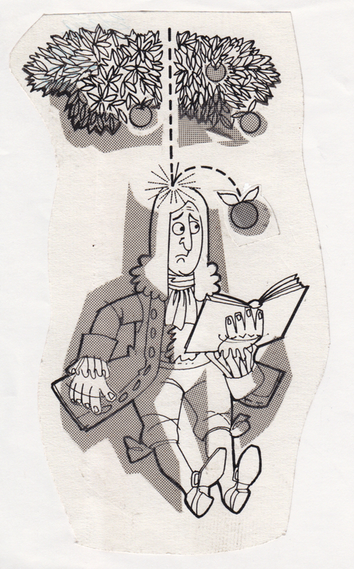 Another spot from Grandpa. This time it's Newton. Date: unknown. Publication: unknown.


We recently completed posters for 2 events serendipitously taking place on the same night (January 22nd), albeit across the nation from one another. Aziz Ansari will be knocking the socks off of a presumably packed house at Carnegie Hall, while I'll be here in Seattle, in awe of White Lies and all of their glory. The Aziz poster is 5 colors, and White Lies is 2 colors, both of which feature metallic silver ink. In the store now!
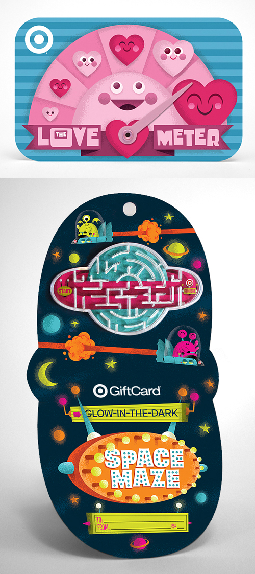 Our latest Gift Cards for Target, The Love Meter and Glow-In-The-Dark Space Maze are now available in stores or online. Grab one for that special someone, and two for yourself.
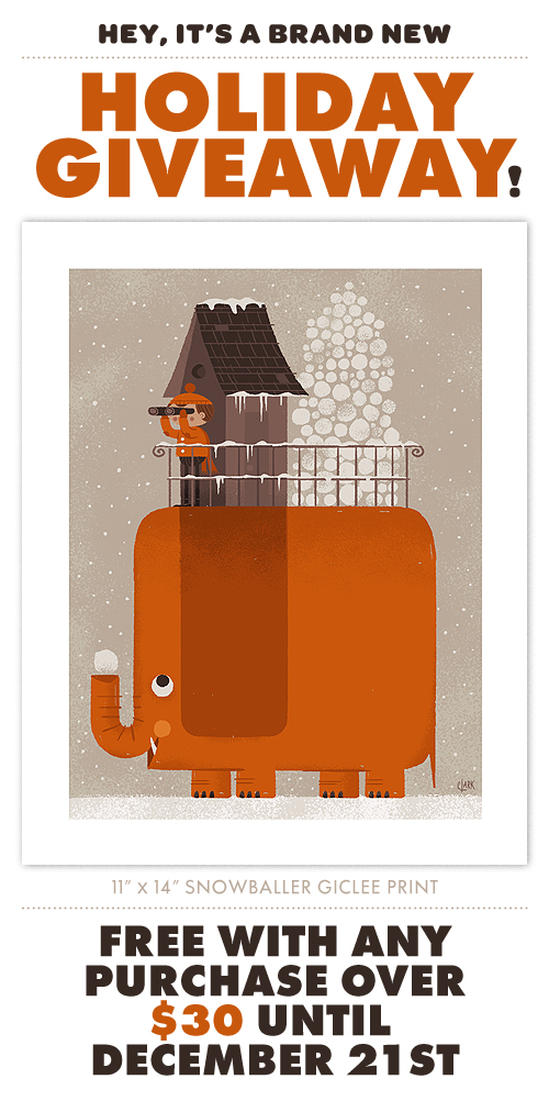 It's been another fantastic year at IC, so we thought we'd share the love a bit. With any purchase over $30 until December 21st, you'll receive our new 11" x 14" Giclee print 'Snowballer'. Inspired by our recent snowmageddon experience here in Seattle, we thought it would be pretty neat to have a large orange pachyderm friend on our side in case that looming snowball fight with the bratty neighborhood kids does indeed happen. Tell your friends.
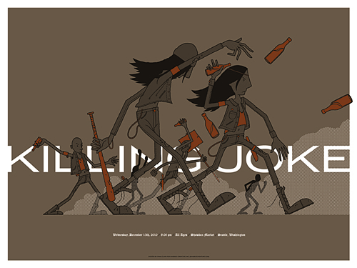 I couldn't pass up the opportunity to design a poster for one of my favorites, Killing Joke. Their music is like the soundtrack to the apocalypse, so naturally, a punk-orchestrated riot seemed like the perfect direction.
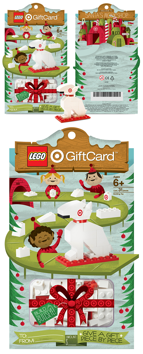 We'll never forget that day in 1983 that our mom brought home a bag of Legos the size of a small car. She had picked it up at a garage sale (who sells Legos?) for $8. From that point on, we were hooked. For obvious reasons, Legos ended up being our favorite toy for years to come - and as with most things in parenting life, it's come full circle and is now my son's favorite toy. Like many folks, those bricks have been a big part of our family.
So as you can imagine, I wish I could hop in one of these to go back and tell my 8-year-old self about our newest project for Target, the Lego Build A Bullseye! Gift Card. We've been fortunate to work on many cool projects over the years, but this one was sorta special. We actually wrapped this up in May, so it's fun to finally see it in stores for the holidays.

Below are some shots of the carrier on press a few months back:


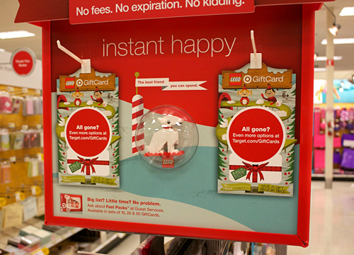
And here is the endcap fixture at the store. They were sold out at noon today, so I'm guessing there are other human beings that like Lego as well.
Thanks to our (always) amazing art director Ted for the brains behind this project, and the fine folks at LEGO for giving us the green light.
Oh, and check out the cool little animation below:
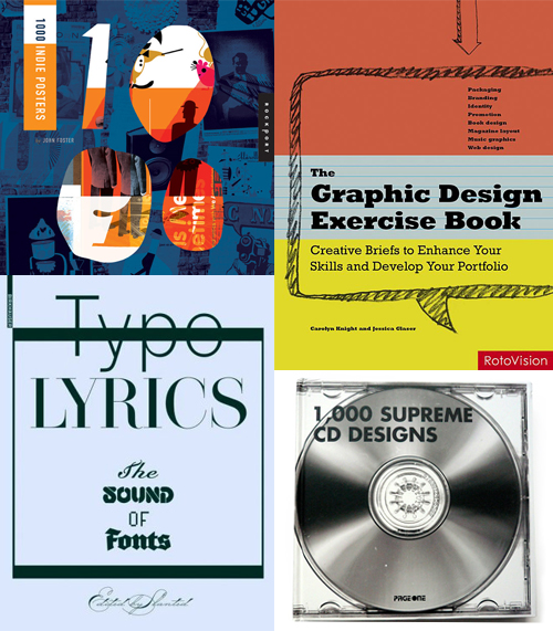 Here's 4 new (ish) books that we've been featured in recently: 1000 Indie Posters by John Foster (out in January), The Graphic Design Exercise Book by Carolyn Knight and Jessica Glaser, Typo Lyrics by Slanted and 1000 Supreme CD Designs by PageOne (This one actually came out in '08 but we spaced on it). Now you know what to get your favorite uncle for the holidays.
 Found this one just in time. Happy Halloween everybody!
 Just wrapped up this cover for Hawk Nelson's forthcoming record titled "Crazy Love." Each of the band's previous records have featured paper airplanes somewhere in the artwork, so our task was to incorporate an airplane on the cover.