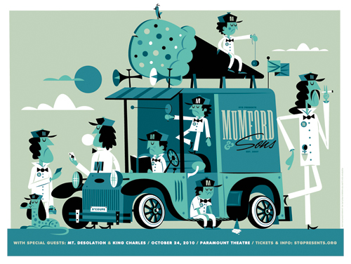
 It's a slow day for Mumford and his offspring. Here's our new poster for the Mumford & Sons show happening on 10/24 at The Paramount. These will be in the shop on 10/25. Oh, be sure to sign up to our mailing list to get the scoop on upcoming poster and product releases.
Filtering by Category: Illustration,Bum Out
 In this series I'm going to try my best not to compare apples to oranges. I understand there are vast differences in technology, ideology, legality, etc between designs of the past and designs of the present. However, I believe there was, is, and will always be a way to almost objectively design something properly. To me, this means a design that is well executed, aesthetically pleasing and properly communicative... in relation to whatever is being "sold."
TWIW, V.2 is in regard to travel advertising. In this case, specifically cruises. Here are my thoughts on the ads in question:
1. I don't even know where to start. How about the copy? Clearly one is simply advertising a specific cruise ship, while the other goes into much more detail about the price, locations, discounts, dates, etc., but that in itself says something about modern advertising's problem with forcing too much information into a single ad. Add to that the tragedy of 5+ arbitrarily used fonts and typesetting that seems to make no sense at all. Except of course for the legal line, which is strategically set in black type over a dark portion of the image. Crafty.
2. We used to marvel at things like the massive Cunard cruise ship, shown above. But as technology and engineering progress, we're less interested in how we'll be getting to our destination and more interested in where it's taking us (and how much it will cost). But aren't these ads for the cruise itself? If you just want to go to The Bahamas, you can fly there in a fraction of the time. This is about the experience of the cruise. And as you can see in the more recent ad, the actual cruise ship has become an afterthought; a footnote.
3. As for the imagery, we're faced with the obvious difference between professional designer and someone with a personal computer. Before the computer we relied on professionals to do the job of advertising. They were skilled in their craft. They knew type and composition and cohesion and color. They designed because they were good at it. I know I'm stating the obvious here, (and there's a heaping helping of irony as I sit here and type this) but it's a bit of a bummer that the computer has turned every civilized human into a jack-of-all-trades.
4. In the end, one is clearly worth framing and displaying in your home, and the other is sure to end up in a trash bin. I refuse to believe that we collect things that are "vintage" purely based on nostalgia. The bottom line is that, in most cases, that old stuff is flat out better than the garbage that we see today.
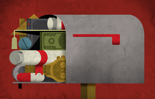 Here's our latest spot for Wired's 'Burning Question' series. This month's question: "Why do we still get so much spam?". If you own an iPad, check out the (simple) animated piece in the upcoming digital issue as well.
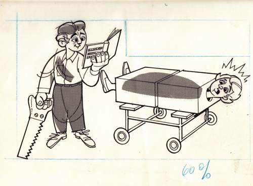
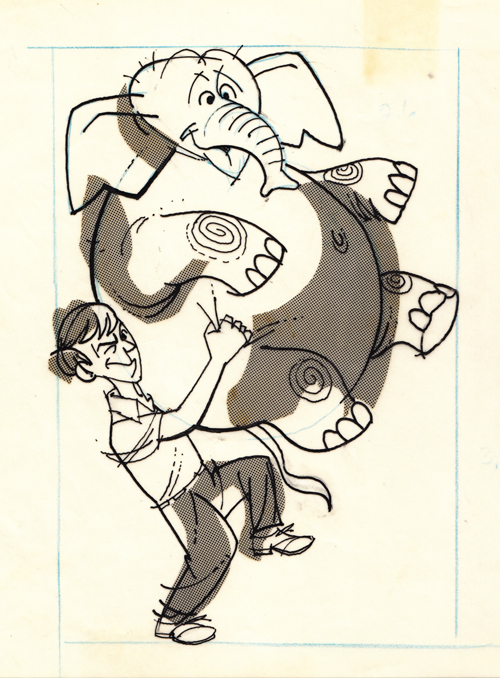
More editorial goodness from Grandpa.
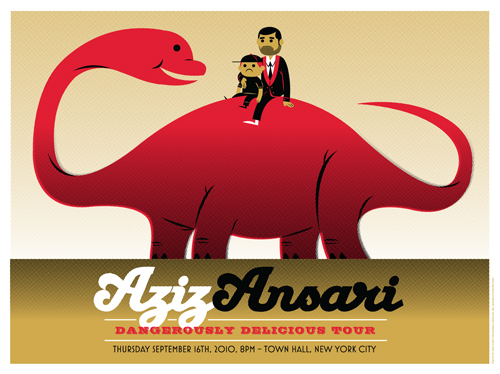

It's always a treat to work with comedians - but in this case it's extra fun as Aziz is one of our favorites. Aziz commissioned us to create posters for the New York and DC shows of his upcoming 'Dangerously Delicious Tour'. If you're a fan, you know that Aziz loves food ... and if you have his last album, you know he also loves walking with dinosaurs. These are limited in quantity, but will be arriving in the shop after the dates.
 Today is a monumentous occasion in our house: First day of kindergarten. I whipped this up last night and hid it in my little girl's lunchbox. I think the first day jitters are worse for parents. Either way, I'm a proud daddy. Update: Enough of you asked, so I decided to make it a small print.
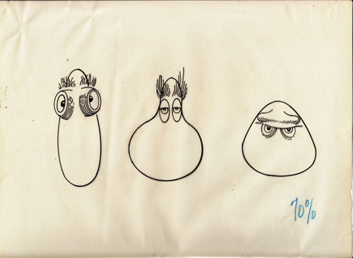


These 3 pieces are some of my favorite from the AP vault. Not only are they a fun batch of mix-n-match monster features, but visual proof that buried somewhere deep within my DNA lies that love of creating monsters. My beloved grandmother recently just turned 86, and as my mom put it - we are 'attempting to mine her memory as much as possible' in regards to grandpa's work. There is just a lot she doesn't remember. My uncle states: "I'm not sure what the purpose was. He may have used them as examples when he was negotiating or demonstrating options to a client". Ahh, character comps. Sounds familiar.
Grandpa was always larger than life to Ryan and I. His career laid the foundation for our love of art. Unfortunately during most of our youth, we lived in different states and didn't get to see him as much as we would have liked. We grew up in Central Oregon while our grandparents lived in a little town called Oroville, about 90 miles south of Sacramento. I remember the yearly visits and the family gatherings at Christmas, but like most families at that time, we didn't have the money to travel often. Unfortunately, my memory of art conversations with him are fairly limited. I just remember always being in awe around him. He had a deep, soothing voice that commanded the attention and respect of everyone nearby. And I remember him always smiling and laughing. I like to think that had something to do with loving his 'job'. But on the other hand, I'm not convinced that artists really differentiate 'job' from 'life'.
In 1989, my father landed a new job in Sacramento. Relocating from a sleepy town in Oregon to a larger city was a big culture shock for me. And ironically - shortly after that, grandma and grandpa actually relocated to Washington state. Grandpa passed away in 1995. I was 20.
At the time of his passing, I was playing music and touring. Being in a band was my life. Art (visually at least) was on the back burner . I knew that it was something I was going to circle back to, but it wasn't in my immediate future.
Now that I'm 35 and have been doing this 'professionally' for almost 10 years, you can imagine how many questions I wished I would have asked him. It's something I can't spend a lot of time thinking about because of the obvious reasons.
I am grateful to have most of his pieces that he left behind, and the many family members who are helping to remember/research where and when these amazing illustrations came from. Many, many, many more to come.
Thanks, grandpa.
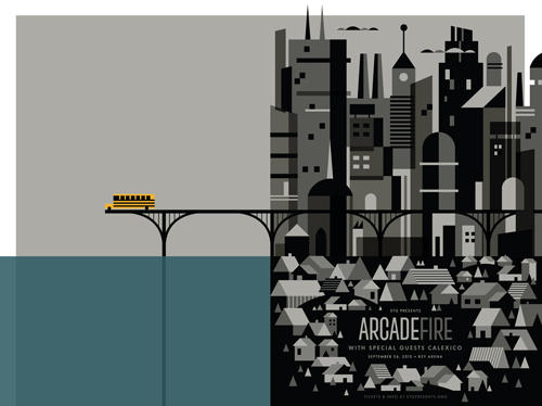 Here's our new poster for Arcade Fire, a band that we haven't been able to get enough of lately. I was inspired by the song 'City With No Children' from their new album, 'The Suburbs'. Available in the shop on September 27th. See it larger.
 I had the idea a while back to post about the perils of modern design, specifically in regard to rebranding, the evolution of a particular design and things of that nature. I've decided to finally pull the trigger and go for it. As my brother has begun posting a series dedicated to our grandfather, I thought this might be the right time. After all... the time period in which our grandfather was designing will often be the era in which my postings will refer to.
"The Way It Was" will be a study (and occasional pseudo-rant) about a particular design of the past, and a directly (or at least somewhat) related piece from recent years.
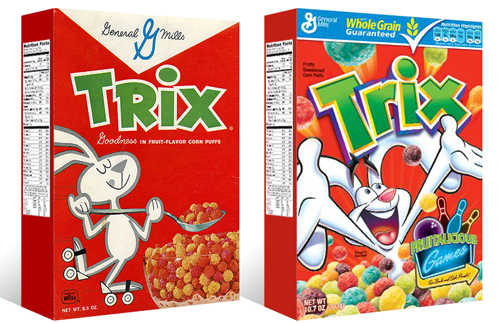
TWIW #001 is based on an email conversation I had with a few like-minded friends a couple of years ago. The subject in this case is a box of Trix cereal. Target had announced that it was re-issuing old General Mills cereal box designs for a limited time, (God bless design-savvy corporations) and in being reminded of that classic old box design, I couldn't help but dissect the modern design and suppose what it's trying to tell today's consumer. Here are my thoughts:
1. The logo, once simple and bold, is now 3-dimensional, has a white stroke, yellow bevel, and emboss. ALL of which have gradients. Somehow this "pops" more.
2. Since brand loyalty is dead, the nice big General Mills logo at the top of the box (which I'm sure used to assure people of the reliability and integrity of the product) is replaced by a very small GM logo, overpowered by a "whole grain guarantee" and a list of other nutritional values. Not that nutrition is anything to shrug at, but let's be real- this is Trix.
3. The cereal itself isn't enough anymore, so there has to be added incentive to buy. In this case, there's an ad for "fruitalicious" games on the back of the box.
4. The fun-loving bunny on cute roller skates is replaced by (honestly) what seems to be an INSANE rabbit, literally throwing Trix at you.
5. Lastly, and probably most importantly, the modern box has a disclaimer sentence that reads something like "cereal shown not actual size," because people are so stupid (or assumed to be so stupid) that they can't comprehend that the 1" macro-lens-photographed meteor puffs on the front of the box are bigger than they actually are.
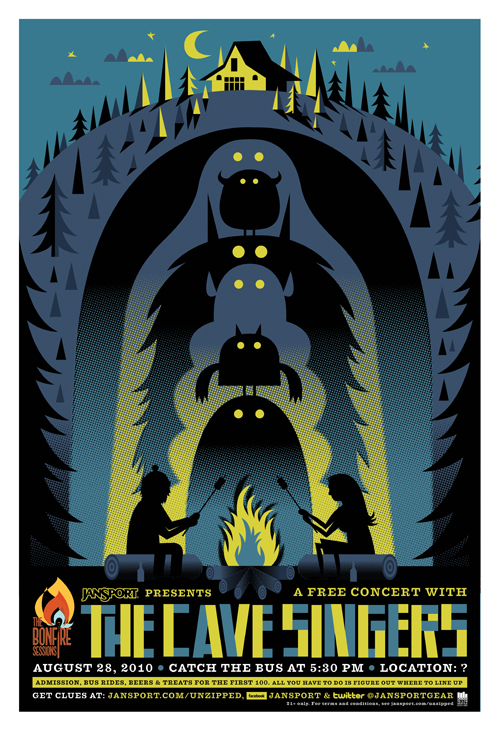 Here's a fun project we recently wrapped with the fine folks at Creature and JanSport. Catch the bus to see The Cave Singers - performing at an undisclosed location. A quick synopsis of the event:
'This summer, JanSport presents the first installment of the Bonfire Sessions, a free concert series celebrating the epic memories that can only be made outdoors. Here’s how it works. The hidden location of the concert is kept secret until the day of the show. All August long, check in here at Unzipped , as well as Facebook and Twitter , to get clues about the band and where to hitch a ride on the 28th. We’re taking a mere two busloads of people, so you’ll want to stay on top of the bus stop spot. And get your best lining-up/dancing shoes on.'
The poster was designed in 2 sizes: 24" x 36" and 18" x 24". 8 colors, screen-printed.
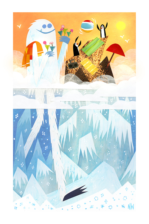
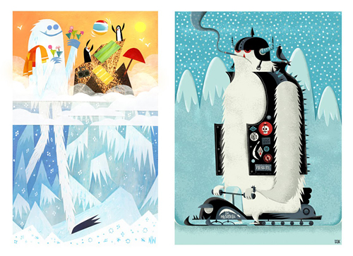 I first met Nate Wragg shortly after I stumbled upon his brilliant work for the film Ratatouille. Namely the 'Your Friend The Rat' short and his great books that were inspired by the film. Many of you are familiar with his fun illustrations and epic character work for Pixar and now DreamWorks. We began chatting as we seemed to share an obvious affinity for all kinds of misc. critters. Namely Sasquatch and the elusive Yeti. It was only natural that a trade was in order.
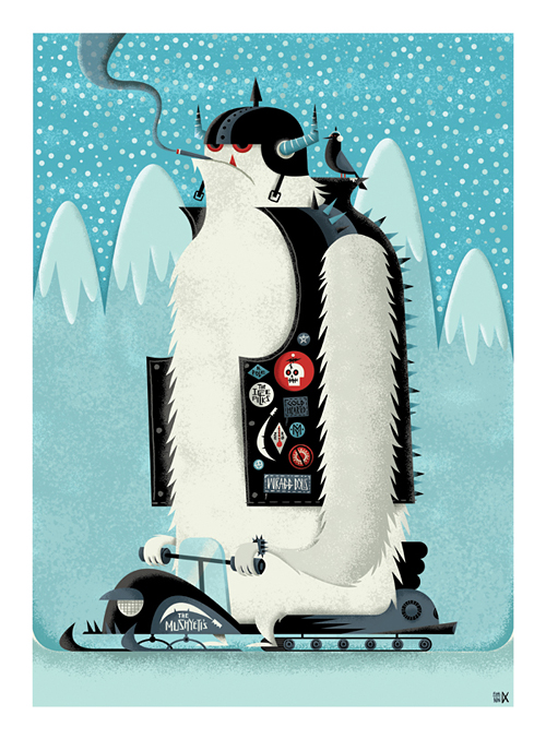
It took me weeks to nail down an idea, but decided that a 'biker Yeti' may be a funny prospect. I quickly started sketching and 'Freddy Mushyeti' was born. He may look a bit menacing, but I guarantee he's harmless. As for the rest of the 'Mushyeti's' crew, I can't exactly say the same.
Nate had the idea that we'd just surprise each other with the Yeti's and ship off the framed pieces without a clue as to what we'd be receiving. It was a great idea and I can't tell you how cool it was to unwrap. I think I may have even injured the UPS man as I ripped it out of his hands. I absolutely love it.
Next year: Swap Of The Sasquatch.
Nate's Yeti: 'A Break from the Snow' / 10" x 16" / Acrylic & Paper Collage / 2010 My Yeti: 'Freddy Mushyeti' / 17" x 23" / Digital / 2010
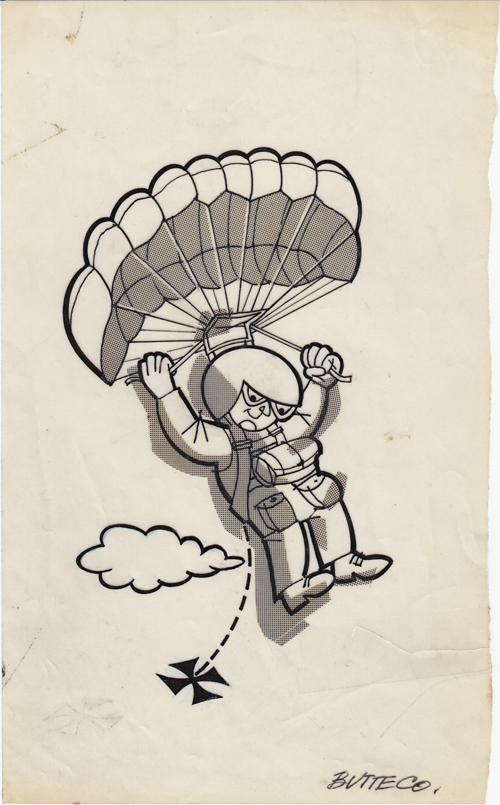 Here's another one from the files. Most likely late 1970's. Post NASA freelance. Looks to be something for 'Butte County'. Possibly a small local newspaper.
 Many of you know that our grandfather, Alfred Paulsen, was a gifted illustrator who worked for NASA for 25+ years. During his tenure there (and after), he dabbled in all kinds of fun freelance work on the side. Recently we've started unearthing loads of his work and will be posting it on the blog from time to time.
I'm not sure what this spot was done for, but couldn't help but crack a smile just looking at it. Circa sometime in the 70's.
Much more to come.
 Here's a recent spot we did for Atlanta Magazine about how 'bookish people like to party'. I couldn't agree more.
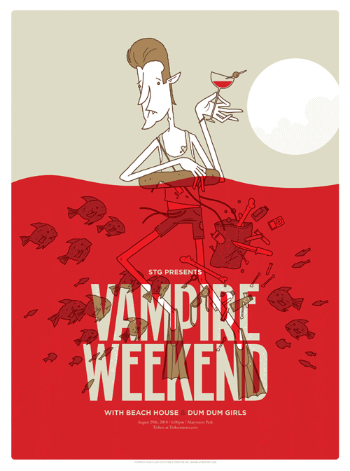 Just finished this poster for Vampire Weekend... couldn't help but go the literal route for this one. Just too fun. Vampire meets piranha- a match made in Heaven.
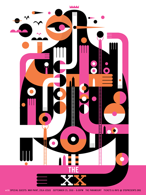 Here's our new (and early) poster for The XX show at The Paramount in September.
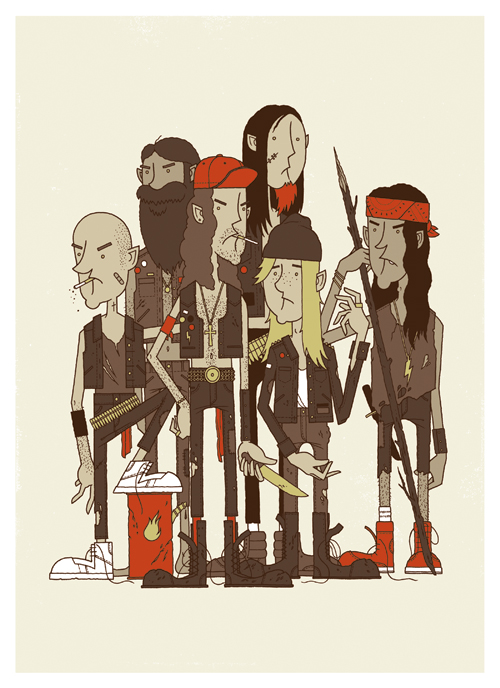 It's the Rowdy Boys Heavy Metal Club! These ruffians may look a little troubled, but they're good kids... just don't tell them you think Inside The Torn Apart is the best Napalm Death album. The brand new 16" x 22" Giclee print is available in the store now.
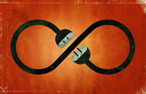 Here's a recent spot illustration for Wired's monthly 'Burning Question' series. This month's question: 'Why Do We Still Have Power Cords'? Hint: they aren't going away anytime soon.
 We are extremely honored that the Minnesota chapter of the AIGA recently recognized all of our 2009 Target projects in their annual Design Show. See details here and here. Many thanks to our incredible A.D.'s over at the bullseye. More fun stuff to share coming soon ...
Super cool 'Thumb War' gift card created by our buddy Christopher Lee.
 Our Conan O'Brien and My Morning Jacket posters have been added to the shop.