 Just wrapped up a new poster for Against Me! at this year's Sasquatch! Festival. I used my own vest for this one. Metallic brown and black. Check our store for this one in a few weeks!
Filtering by Category: Design
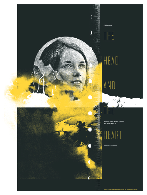 Here's a look at the poster we just wrapped up for The Head And The Heart, who will be playing 2 shows here in Seattle at the end of April.
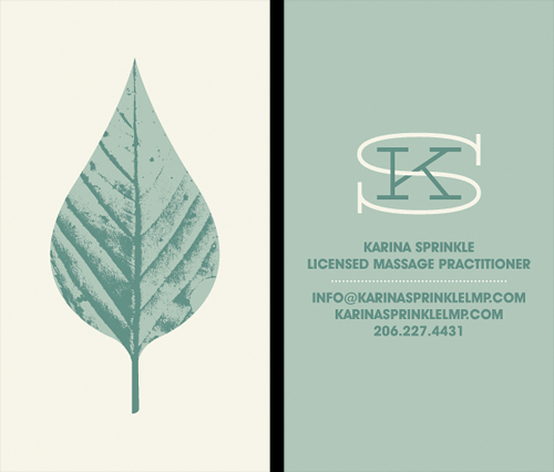 Our longtime friend, Karina Sprinkle, asked us to create the identity for her new massage practice. The idea was to convey a sense of calmness and peace, but steer away from typical massage related imagery (hands, Papyrus font). The leaf seemed like an appropriate direction, given their often medicinal qualities, and it also gives a little love to the great PNW. Here's a look at the business card.
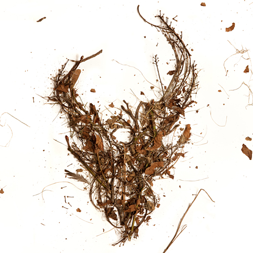 Here is the cover for an upcoming Demon Hunter release featuring the first 3 albums in one package. The 3 disc set will be available everywhere March 8th. If you've had trouble finding these older releases in a store near you, here's the chance to get them all (and cheaply). As always, the DH demon skull graces the cover, this time made from the trees of my back yard. I gathered up some fallen branches and leaves, constructed the logo on a large sheet of white paper, and Jerad Knudson shot the photo.
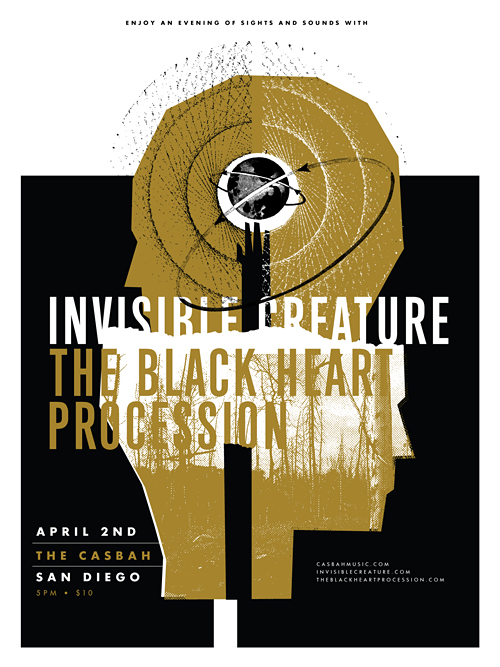 Last year, our buddy Josh Higgins asked if we'd cruise down to his city sometime to tell our story and flash some .jpg's on a big screen. We happily agreed, so here we are. We're excited to bring our dog and pony show to the beautiful city of San Diego on April 2nd. We'll be speaking at the legendary Casbah club, but what we're most excited about is The Black Heart Procession will be joining us to shut down the evening. Oh, and a little bonus for you early birds: The first 200 folks through the door get an 18" x 24" silk-screened poster, namely the one you see above. Tickets are $10 advance/$12 day of show and you can purchase them here.


We recently completed posters for 2 events serendipitously taking place on the same night (January 22nd), albeit across the nation from one another. Aziz Ansari will be knocking the socks off of a presumably packed house at Carnegie Hall, while I'll be here in Seattle, in awe of White Lies and all of their glory. The Aziz poster is 5 colors, and White Lies is 2 colors, both of which feature metallic silver ink. In the store now!
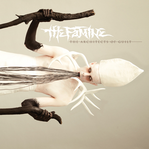 We just wrapped up the artwork for our friends, The Famine, and after an interesting photo shoot of blowing black body paint on a total stranger through a straw, I'm glad to say I'm pleased with the outcome. Be afraid.
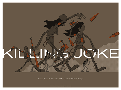 I couldn't pass up the opportunity to design a poster for one of my favorites, Killing Joke. Their music is like the soundtrack to the apocalypse, so naturally, a punk-orchestrated riot seemed like the perfect direction.
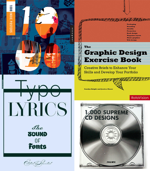 Here's 4 new (ish) books that we've been featured in recently: 1000 Indie Posters by John Foster (out in January), The Graphic Design Exercise Book by Carolyn Knight and Jessica Glaser, Typo Lyrics by Slanted and 1000 Supreme CD Designs by PageOne (This one actually came out in '08 but we spaced on it). Now you know what to get your favorite uncle for the holidays.
 Just wrapped up this cover for Hawk Nelson's forthcoming record titled "Crazy Love." Each of the band's previous records have featured paper airplanes somewhere in the artwork, so our task was to incorporate an airplane on the cover.
 In this series I'm going to try my best not to compare apples to oranges. I understand there are vast differences in technology, ideology, legality, etc between designs of the past and designs of the present. However, I believe there was, is, and will always be a way to almost objectively design something properly. To me, this means a design that is well executed, aesthetically pleasing and properly communicative... in relation to whatever is being "sold."
TWIW, V.2 is in regard to travel advertising. In this case, specifically cruises. Here are my thoughts on the ads in question:
1. I don't even know where to start. How about the copy? Clearly one is simply advertising a specific cruise ship, while the other goes into much more detail about the price, locations, discounts, dates, etc., but that in itself says something about modern advertising's problem with forcing too much information into a single ad. Add to that the tragedy of 5+ arbitrarily used fonts and typesetting that seems to make no sense at all. Except of course for the legal line, which is strategically set in black type over a dark portion of the image. Crafty.
2. We used to marvel at things like the massive Cunard cruise ship, shown above. But as technology and engineering progress, we're less interested in how we'll be getting to our destination and more interested in where it's taking us (and how much it will cost). But aren't these ads for the cruise itself? If you just want to go to The Bahamas, you can fly there in a fraction of the time. This is about the experience of the cruise. And as you can see in the more recent ad, the actual cruise ship has become an afterthought; a footnote.
3. As for the imagery, we're faced with the obvious difference between professional designer and someone with a personal computer. Before the computer we relied on professionals to do the job of advertising. They were skilled in their craft. They knew type and composition and cohesion and color. They designed because they were good at it. I know I'm stating the obvious here, (and there's a heaping helping of irony as I sit here and type this) but it's a bit of a bummer that the computer has turned every civilized human into a jack-of-all-trades.
4. In the end, one is clearly worth framing and displaying in your home, and the other is sure to end up in a trash bin. I refuse to believe that we collect things that are "vintage" purely based on nostalgia. The bottom line is that, in most cases, that old stuff is flat out better than the garbage that we see today.
 As They Sleep is a new band on Solid State Records, bringing some much needed brutality to the masses. This is the album cover that we recently completed for their upcoming release titled Dynasty. We again enlisted photographic/set design whiz Jerad Knudson to help us see the vision through, and we couldn't be happier with the results. Apparently the model is a homeless man that sells newspapers near Jerad's house in Seattle's Capital Hill neighborhood.
 I had the idea a while back to post about the perils of modern design, specifically in regard to rebranding, the evolution of a particular design and things of that nature. I've decided to finally pull the trigger and go for it. As my brother has begun posting a series dedicated to our grandfather, I thought this might be the right time. After all... the time period in which our grandfather was designing will often be the era in which my postings will refer to.
"The Way It Was" will be a study (and occasional pseudo-rant) about a particular design of the past, and a directly (or at least somewhat) related piece from recent years.
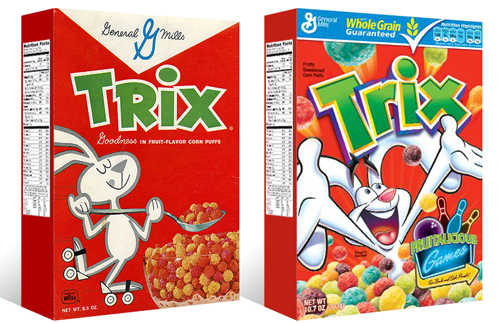
TWIW #001 is based on an email conversation I had with a few like-minded friends a couple of years ago. The subject in this case is a box of Trix cereal. Target had announced that it was re-issuing old General Mills cereal box designs for a limited time, (God bless design-savvy corporations) and in being reminded of that classic old box design, I couldn't help but dissect the modern design and suppose what it's trying to tell today's consumer. Here are my thoughts:
1. The logo, once simple and bold, is now 3-dimensional, has a white stroke, yellow bevel, and emboss. ALL of which have gradients. Somehow this "pops" more.
2. Since brand loyalty is dead, the nice big General Mills logo at the top of the box (which I'm sure used to assure people of the reliability and integrity of the product) is replaced by a very small GM logo, overpowered by a "whole grain guarantee" and a list of other nutritional values. Not that nutrition is anything to shrug at, but let's be real- this is Trix.
3. The cereal itself isn't enough anymore, so there has to be added incentive to buy. In this case, there's an ad for "fruitalicious" games on the back of the box.
4. The fun-loving bunny on cute roller skates is replaced by (honestly) what seems to be an INSANE rabbit, literally throwing Trix at you.
5. Lastly, and probably most importantly, the modern box has a disclaimer sentence that reads something like "cereal shown not actual size," because people are so stupid (or assumed to be so stupid) that they can't comprehend that the 1" macro-lens-photographed meteor puffs on the front of the box are bigger than they actually are.
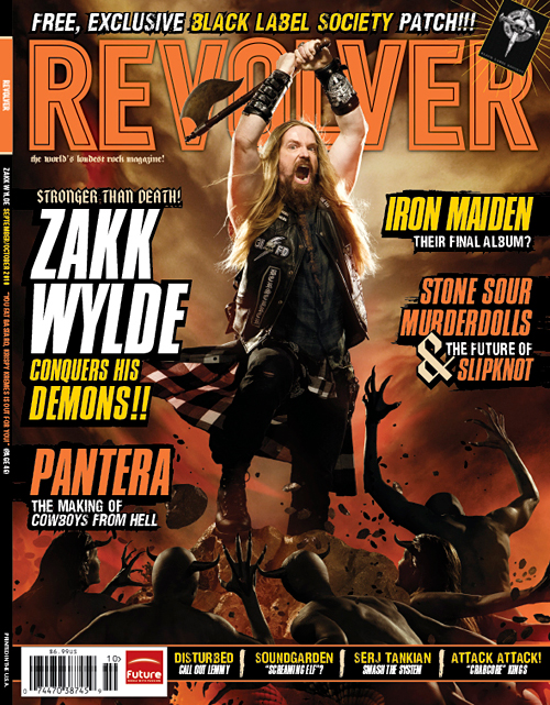
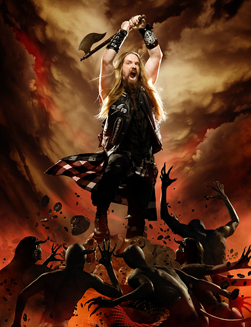
Check out your local newsstands now for the new issue of Revolver Magazine, featuring Zakk Wylde. We did the photo-illustration work for the cover and the feature, which meant many hours of cutting out little demon people to create the elaborate scenes. The cover image itself pays homage to recently deceased Frank Frazetta's classic artwork.
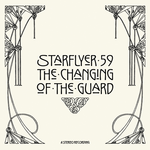 Just wrapped up the artwork for Starflyer 59's 12th album, "The Changing Of The Guard." The music, as always, is incredible... and it's always refreshing to work with Jason Martin, a guy who truly "gets it."
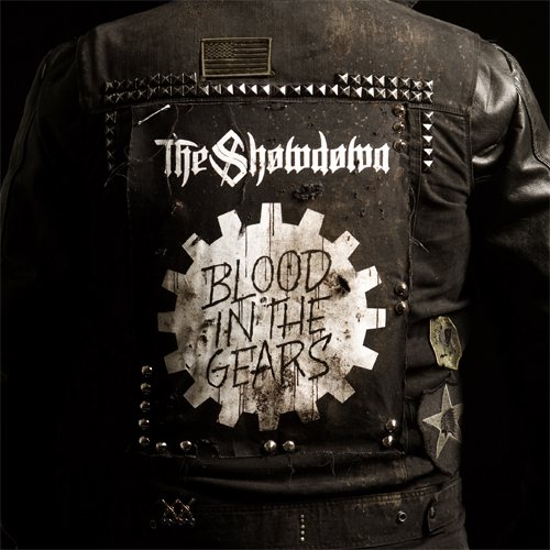 Check out the cover we recently finished for our buddies The Showdown. The new record, Blood In The Gears, has a very gritty, Southern, biker sound to it, so that's exactly what we went for. That's me in the jacket, and there's no Photoshop magic here- we had the back patch made just for the cover. Ride to live...
 Here's the cover for new Solid State band, To Speak Of Wolves' debut release. Hands are still tough for me. I probably drew 15 pairs of hands before I felt like I got it right...
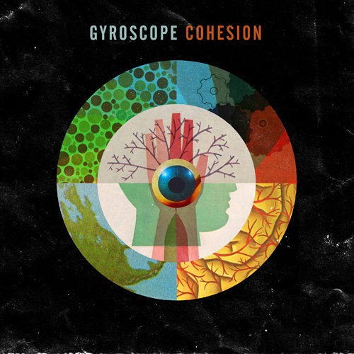 We just wrapped up the cover for 'Cohesion', the new album from Perth's own
  When Nonsek asked us if we'd like to open an IC artist channel, we took a gander at their current roster and quickly said "mmmmkay". If you haven't played around with their super-cool custom T-shirt remix madness, do yourself a favor and check it out. Infinite options! And now you can choose shirt colors and even lock layers that you dig.
You know what I'm thinking? This could make a REALLY great gift. Just sayin' ...
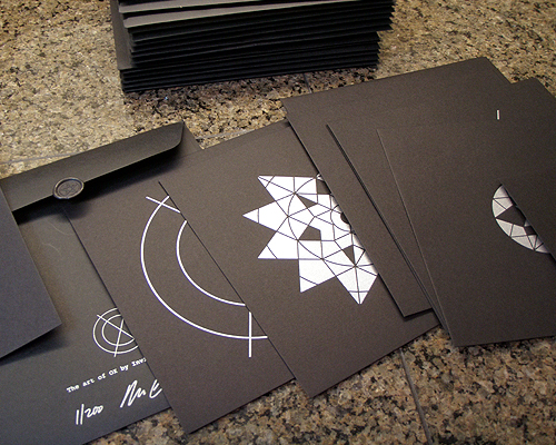 Coalesce is graciously allowing us to sell a limited run of the 'Art Of OX' art print sets.
The 'Art Of OX' art print set features 12 hand printed, frameable 8 " x 8" prints. Each set comes in a wax sealed envelope, and are signed and numbered. We have been given 45 sets to distribute through IC. Of these 45 sets, 35 are printed on black stock with silver ink, the remaining 10 sets are printed on brick red stock with dark red ink and will be randomly distributed.
And don't forget, the album drops this Tuesday.